SKY CREATIVE

After Effects Photoshop Illustrator Cinema 4D Premiere

Since 2020, I have been lucky to repeatedly collaborate as a freelance Motion Graphic Designer with Sky Creative, Sky’s in-house agency.

Sky is a British broadcast and telecommunications company, Europe’s largest media and pay-tv broadcaster. 

While working for them, I’ve had the opportunity to be involved in many tv and social media ads in various formats, as well as OOH and perimeter advertisements for several of its products and channels.

BLUE DROP STUDIO

Photoshop Illustrator InDesign After Effects
Premiere XD Sketch Invision

During the period of 2018-2019 I worked as a Digital and Motion Graphics Designer for a small Digital Marketing Studio based in London called Blue Drop Studio. This studio main service is to provide brands with social media campaigns, although they also provide branding and website design and development services.

Kwiff

Blue Drop Studio’s main client was the betting app Kwiff an emergent betting app and start-up where we worked as part of the in-house marketing team. Due to the limited resources of the start-up, my tasks were plenty and varied: editing and exporting ads for TV, content creation for social media, participating in several phases of digital campaigns, from planning and development to campaign creation; providing graphic app items as well as working with the UX/UI team to develop several UI elements. After Blue Drop Studio decided not to continue working for them, I stayed as a freelancer while they found a different creative team.

Bellow you will find a quick showreel with a few of the elements I created. The music is a mash-up made with pieces of the sound of the TV adverts developed by the Swedish VFX and 3D Studio Filmic Art (for which I created some of the animated elements, as well as some variant edits) and voices from Patrice Evra, who collaborated in one of campaigns.

kwiff-landing-page-graphics-example
Example of a Landing Page Gif for Kwiff Casino
kwiff-social-media-graphics-example
Example of a Social Media Video for Kwiff Casino

Other Projects

As part of Blue Drop Studio, other projects I worked in were: the creation of several variants of the logo for the scarves and handkerchiefs brand Stole & Boa;  collaborating in the creation of different assets for the washroom services company Woosh; collaborating in the creation of the logo and icons for Shorebox; and the creation some assets for a cover of the architecture magazine Onoffice.

Additionally to the above, I also created some assets for Blue Drop Studio’s website and social media with content of their clients, some of which you could see bellow.

Woosh-products
OnOffice-cover

YOUBETCHA!

Photoshop Illustrator Cinema 4D After Effects After Effects Premiere XD Sketch Invision CSS&HTML

During the year 2020, I worked as a freelancer for the emergent online casino Youbetcha! As the only designer in a brand new online casino, I worked on the creation and development of the brand identity, the design of the UI and the creation of online content and advertising.

Youbetcha! is set to be FIAT and Cryptocurrency casino, with a fresh character and appealing to a young audience. The hand-drawn style wordmark instils a joyful and playful vibe with slanted shapes that gives a sense of movement and action.

youbetcha logo
Youbetcha logo primary colour
youbetcha logo
Youbetcha logo secondary colour

An important part of my job was designing the UI of the online casino, together with coding the front-end mockups to send to the developers to integrate into the platform.

Some innovations Youbetcha! brings into the online casino was a multi-screen/multi-slot system in which you could be playing up to 4 different screens/slots in the same browser tab on laptops and desktops(2 in the case of tablets); and the gamification of the casino experience, where the player could be winning XP points, badges and loyalty points, and could participate in continuous tournaments and promotions.

I’ve set a navigation experience that you can test and go through all the different screens of the online casino here. You can log in straight away by writing anything on the fields asked or go through the signup process (also can write anything with no need for it to be real information as nothing will be checked or stored). Notice that this is just a mockup to show the UI design of the online casino, so some functionalities might not work and there might be some dead ends (these are just the screens I sent the developers for them to create the real thing). 

youbetcha screens
youbetcha all screens mobile

In addition to all the graphic elements, I created the assets to promote the casino such as external landing pages, banners and social media ads and organic assets, some of them in the reel below.

VEMA – OCEAN GYRE

Photoshop Illustrator InDesign

Design for the first album and t-shirts of the post-rock band VEMA.  The theme that runs throughout the album is the water, and it is the main concept as well for the album cover and the design for the t-shirt.

Vema cover
Vema backcover
Vema t-shirt
vema t-shirt

GLASSWORK – METABOLE

Photoshop InDesign

Design for the inlay of the latest work of the band Glasswork, with cover and concept art designed by The Real Theory. I reproduced the element of the sea throughout the pages of the booklet, playing with the brightness of it to give the impression of the pass of time, as if by when you arrive to the end of it and the monolith emerges from the sea with the sun in the middle of it, the sun is about to rise. The monolith is also repeated turning horizontally along the inner side of the digipack, creating a sensation of movement.

metabole glasswork

I worked on the design of a one-ink screen printed t-shirt depicting the elements of the monolith and the sea in blue over a grey t-shirt.

glasswork tshirt

I also designed an animation for Spotify Canva, a 8 second video to use in Spotify to loop in the background as you play the songs of the album. Underneath a mockup of how this will look in place.

ENNORTED MAGAZINE

Photoshop
Illustrator
InDesign

I created Ennorted together with a few former classmates. Due to the lack of cultural magazines covering alternative cultural events in our city, Malaga, we decided to create our own one. Ennorted was meant to be an online publication with a quarterly free paper magazine. We decided that the printed form of the magazine would have a peculiarity that could be eye-catching and people would want to store it after reading it, in order to make a higher impact and possibly increase the number of visits to the website. We concluded that printing it in a folded A2 format with a poster that included the information of the highlighted events for the next three months would be an interesting and original way to achieve our goal.

Ennorted-cover
ennorted-back-cover

The name of the publication makes reference to a word that is only used in our hometown, "ennortado", which could translate as "being lost, having someone's head on the clouds", and adding the English suffix "-ed". That word game comes from our intention to be a reference magazine so people would know what was going on in the cultural life of the city with a fresh and renewed vision.

ennorted
ennorted
ennorted
ennorted

Even though we couldn’t go ahead with the project, due to professional reasons, I decided to design the printed format of it, so I could visualise what the final result would have been.

The colour theme is based on the city flag. The graphic content on this mockup version has been taken from different publications.

ennorted

NEON LIGHTS

Illustrator
After Effects
Photoshop

Neon-like signs inspired by several pubs and bars in my hometown, that I used to love going in my teenage years. As I wasn't so keen on their actual logos and signs I decided to take another approach and imagining how I'd like those logos and signs to look like. This is an ongoing project, as there are many more places in my city that shaped my youth and the youth of my friends living in Fuengirola during that period of time.

eltaconacho
crazydiamond
molotov-cocktail

BRISTOL GIFS

Illustrator
After Effects
Photoshop

I lived in Bristol, a really beautiful, inspiring and alternative city, for two years, from 2015 to 2017. During most of my time there I lived in the vibrant neighbourhood St. Pauls. This area is known for its carnival and the diversity of cultures and nationalities that welcomes. As a homage to that neighbourhood I made a couple of gifs inspired by its vibe.

The first one portraits a serie of elements I was used to when living there: hearing to the musicians and selectors rehearsing at their houses while I walked back home from work, the noise of young skaters passing by the street, the visits of cats to our common yard, and watching hot-air balloons through the window.

The second one is inspired in the house just in front of mine. It was an abandoned house that they were planning on demolishing, and its facade was packed with tags and raves and concerts posters.

city-road
city-road-building

GLASSWORK – FEAR AND TREMBLING

Photoshop
InDesign

Design for the second album of the Progressive Rock band "Glasswork". The album is based on the book written by the Danish philosopher Soren Kierkegaard "Fear and Trembling", in which he explains existentialism through the story of Abraham and Isaac. What I wanted to express in the artwork was the grief and the feeling of delusion of a father asked by God to cross the desert, all the way through the Moriah mountain and sacrifice his son.

glasswork-album

I also designed the poster for their album’s presentation and t-shirts, both with the same image. The image shows a mountain, representing the Moriah mountain, with the overprinting of a geometric figure which symbolize the individualism (the full semicircle) versus the universalism (the semicircle formed by geometric figures).

glasswork-tshirt
glasswork-tshirt
glasswork-poster

CONVERSE

Illustrator
Photoshop

Set of posters made for an assignment of the master's degree in Graphic Design at Gauss Multimedia School, in relation to a briefing for the brand Converse.

I tried to give the posters that feeling of rebellion, street and youth culture that are inherent to the brand. For one of them, trying to show the rebellious character of the brand, I took as an inspiration the "Soviet Posters" style, which the street artist Shepard Fairey brought back to live in the 90's. The second one is inspired on a camouflage pattern, but I decided to use elements appealing to a younger generation.

The last one shows a pair of trainers hanging from the electricity cables, an image that is very typical and well-known in some neighbours. The laces form the lettering with the name of the brand.


  • converse-poster
  • converse-poster
  • converse-poster

PRINTSTER MUGS

Illustrator
Photoshop

Mug designs for the online personalised gift shop "Printster", for whom I made designs occasionally while I was working for them as a production worker.


  • tatoo-mug
  • moon-mug
  • polaroid-mug
  • coffe-mug
  • tea-mug
  • cycling-mug
  • birthday-mug
  • penguins-mug
  • snowman-mug

FIMA FESTIVAL

Illustrator
Photoshop

Fictional festival posters made for a graphic design master. The festival is supposed to last three days, each day dedicated to a different style of music : rock, electronic and indie.

I based the posters in the Gestalt Law of Past Experience. Given the recognisable silhouette of the famous headline frontmen, it wouldn't be necessary to represent their entire faces, but only their different haircuts, for the character behind them to be recognisable to the public.

I also took inspiration from the psychedelic rock posters from the 60s and 70s to create the lettering, which fits to the face shape.


  • fima-rock
  • fima-electronic
  • fima-indie

GLASSWORK – KNOTS

Photoshop
InDesign

Design for the first album, t-shirt and background projection of the Prog-rock band "Glasswork". They all include drawings from the artist Gala Fiz.

glasswork-album-knots
glasswork-tshirt-knots
glasswork-gif

REELEYES

HTML
CSS

Reeleyes is a layout project for a webzine about cinema, series, animation and other content audiovisual lovers could find interesting. This project was created as an assignment for the Master's Degree in Web Design of the Gauss Multimedia School. As it was only a layout project, most links don’t lead  anywhere and since it was done quite long time ago (2014) some of the videos shown might have been removed. Click here to see the project online.

reeleyes

JAPAN FOOD COVERS

Photoshop
InDesign
Illustrator

Fictional cover for a Japanese cooking book called "Japan Food". This work was made for a graphic Design master following a briefing previously provided to us. The cover resembles a sushi roll. All the pieces are die cut and each one represents a different piece of the sushi roll : the flap cover looks like the nori seaweed, screen printed on a textured paper with the color of the seaweed; the cover, also screen printed, represents the rice and avocado and reveals the endpaper, that looks like a tuna with fat stripes.

japan-food-front-flaps
japan-food-cover
japan-food-front-endpapers
japan-food-back-endpapers
japan-food-back-cover
japan-food-spine

PEPPERMINT HOTELS

Illustrator
Photoshop

Peppermint is a fictional hotel brand created for the master in graphic design I took on Gauss Multimedia. Peppermint is supposed to be a modern urban hotel chain, usually located in the old area of the cities. The decoration of their hotels is minimalist and they use ecologic materials in construction and decoration.


  • peppermint-hotels
  • peppermint-hotels-logo
  • peppermint-hotels-logo
  • peppermint-hotels-logo
  • peppermint-stationery
  • peppermint-web

DJANGO UNCHAINED POSTERS

Illustrator
Photoshop

Fictional posters were made for a graphic design class, for Tarantino's movie "Django Unchained".

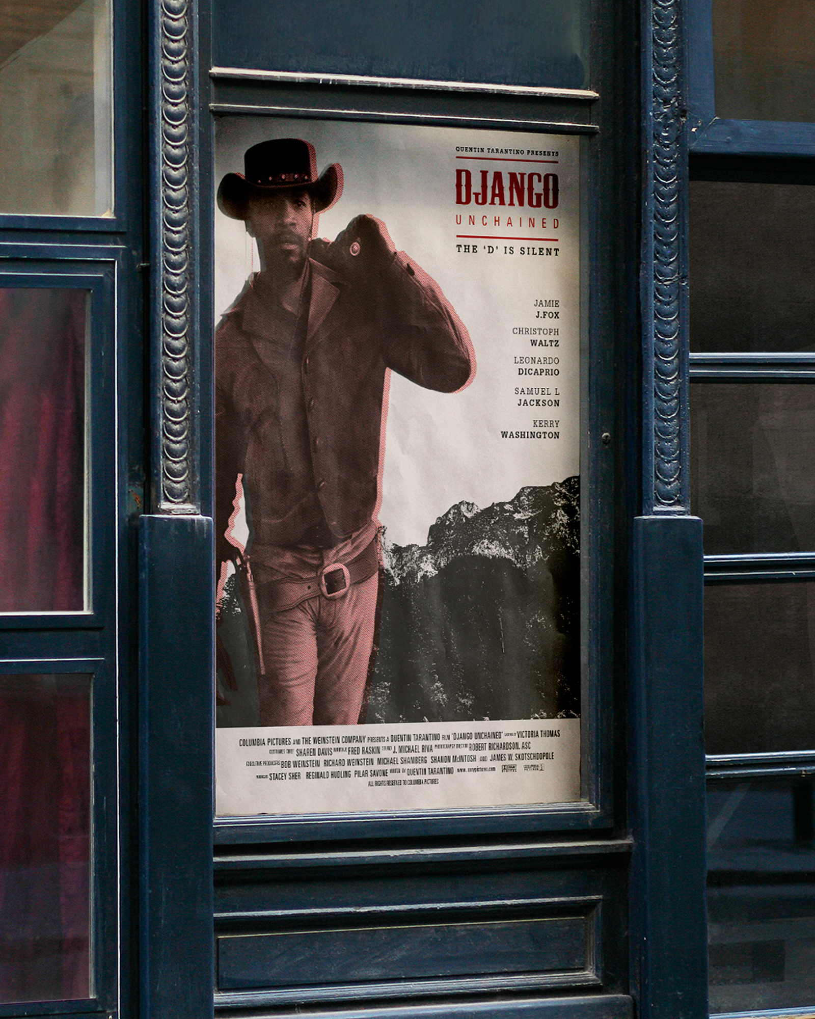
The first one is a commercial poster, where I tried to represent the sense of past times in which the movie is based, mainly by the use of halftones and textured paper; and the use of violence and blood, characteristic of the movie director, by the use of the colour red, so present in the movie.

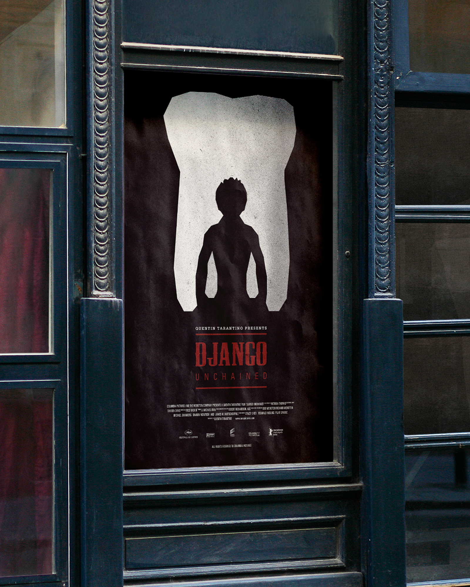
The second one is a promotional poster. For this one, I tried to make a jigsaw based on the Gestalt's Law of Past Knowlegde, as the relation between the two main components of the poster won't be fully understood until after watching the film; and the Principle of Reification and Multistable Perception, as the main figure of the poster is based in two objects, which are both a separate element and part of the other, by a relation of background-foreground in both senses.

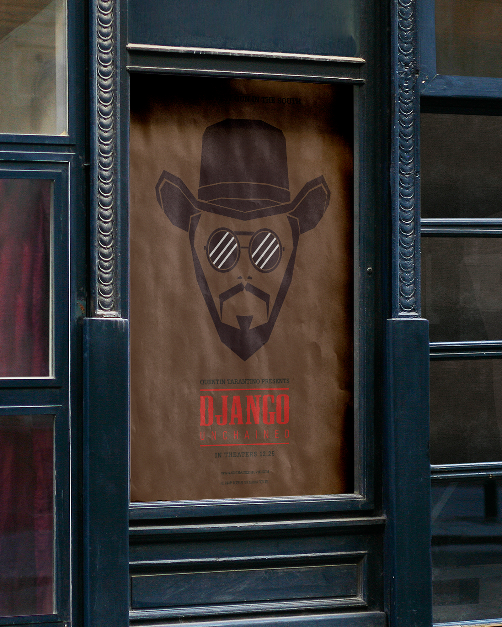
The last one is the poster for festivals. This one is a flat-style portrait of the main character of the movie. The choice for the background colour of the poster comes straight away from the movie and the story behind it, as the movie is based on slavery years and revolves around the idea of racism, viewed mainly through the vision of the main character, a black man in an era of racism and slavery.


  • django-poster
  • django-poster
  • django-poster